
Once again exploring white space issues, I decided to create this page using a limited palette of colours and again using the rule of thirds to suggest a layout which is both easy on the eye and structured in such a way as to allow the eye to follow along a linear path from top right to bottom left of the spread. The white space enhances and almost forces the eye from the left side of the page to the right.
This is the first page where I’ve used the new Distress Crayons from Tim Holtz & Ranger ink. My opinion…not that impressed!
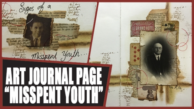
My creation process can be watched from start to finish in the YouTube video link above.


This is my favourite page so far. So simple and still so artistic and beautiful ❤ Wow!
LikeLiked by 1 person
Thank you XO
LikeLike
Hi Mike! Another great layout in your quest to conquer white space. The limited color palette worked beautifully. I’m looking forward to watching the video.
LikeLiked by 1 person
I love your page. And I love watching you play. Everything is so neat and clean. Something I always try and just can’t keep up. My working place is always messy and no matter how I try I can’t help it. 😦
I wonder if you sort of plan your pages. Do you ever start something and then just let your ideas flow ?
I hope you understand what I mean. It’s not that easy for me to explain things in English.
LikeLike
Ooh I really like this one Mike-outstanding!!!!! Liz Ferguson Date: Tue, 12 Apr 2016 16:11:45 +0000 To: chaveluca@hotmail.com
LikeLike
I’ve been a big fan of white space ever since my art school days years and years ago. Not exactly sure why. It takes some thought to create pages with effective use of white space. I’m so happy you are exploring it.
LikeLike
Original your pages with this vintage limited palette of colours and this “occupation” of the space! Bravo!!
LikeLiked by 2 people
I love this page. Great use of white space again. Also, I totally agree with you about the distress crayons, I was not at all impressed.
LikeLiked by 1 person
I love this Mike, it has a vintage feel which I love.
Hugs
Linda xxx
LikeLiked by 1 person
Another fantastic page, Mike! I really love the composition and the way the use of circles contrasts with the straight lines. You are the umpteenth person to state that the distress crayons do not meet expectations. I won’t be adding those to my wish list then.
LikeLiked by 1 person